This website uses cookies so that we can provide you with the best user experience possible. Cookie information is stored in your browser and performs functions such as recognising you when you return to our website and helping our team to understand which sections of the website you find most interesting and useful.
Welcome to your website
Explore your custom elements, text styles & color codes that will help you showcase and organise your content effectively.
In this page, you will also learn how to manage templates, menus & Gutenberg blocks.
Text styles
Blocks
Headings
Website body headings, such as H1, H2, H3, etc., are HTML tags used to structure content and provide hierarchical organization. They play a crucial role in SEO as search engines assign higher importance to headings in descending order (H1 being the most important). This hierarchy helps search engines understand the content’s context and relevancy. Properly optimizing headings with relevant keywords can improve search engine rankings and overall website visibility.
Heading 1
Heading 2
Heading 3
Heading 4
Heading 5
Heading 6
Paragraphs
This is a paragraph. A WordPress paragraph refers to a content element within the WordPress editor that represents a block of text or written content on a webpage.
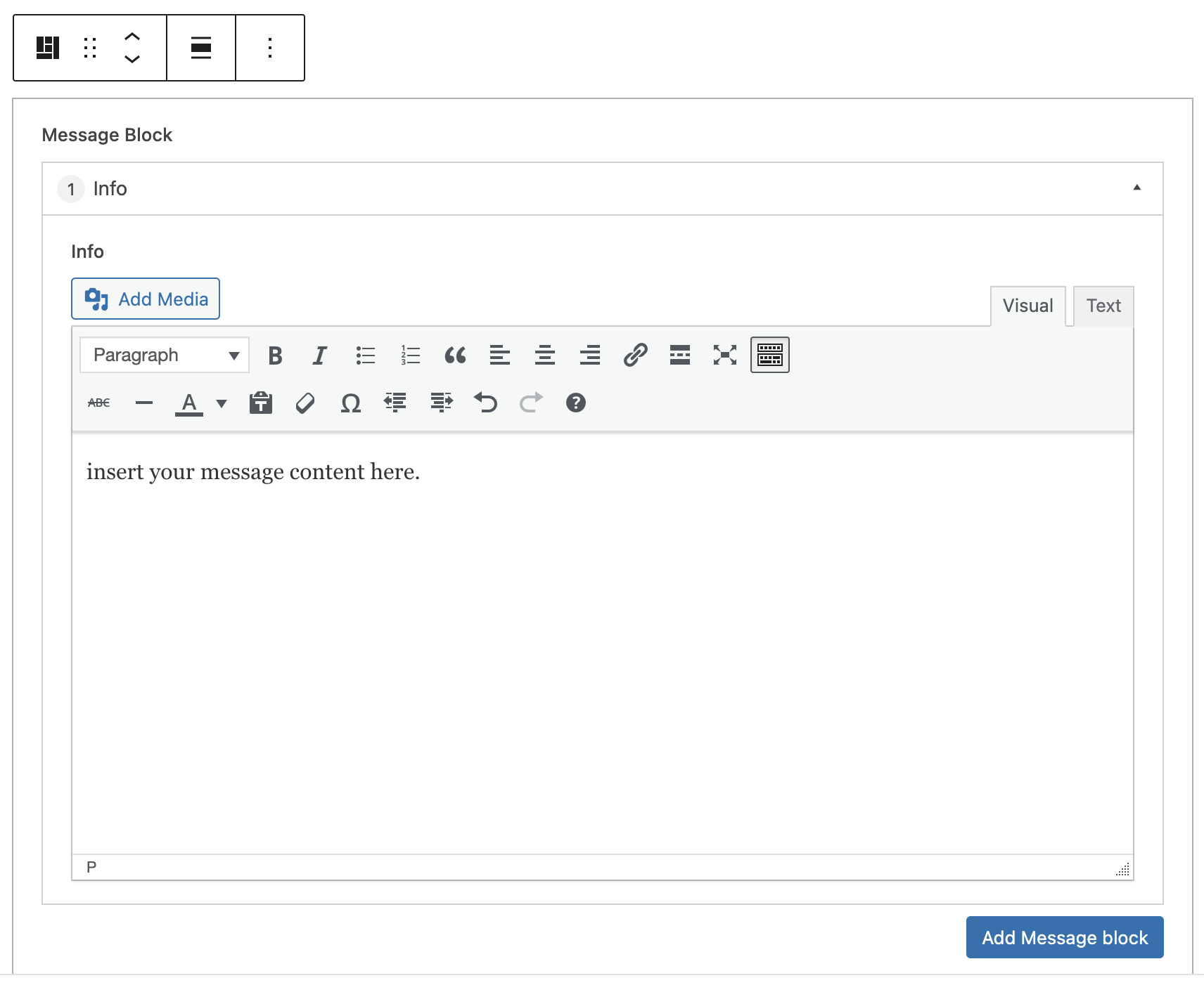
It is possible to add media to paragraph blocks.
Links
Adding links allows users to click on the text and be directed to the specified URL. Links can be set to open in a new tab ensuring that the original page remains accessible, which is useful when linking to external websites or important references.

Select the text you want to link and click on the Link item on the block toolbar
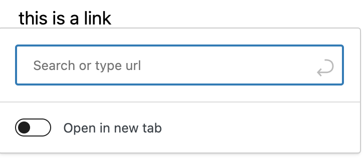
Type or paste the destination URL
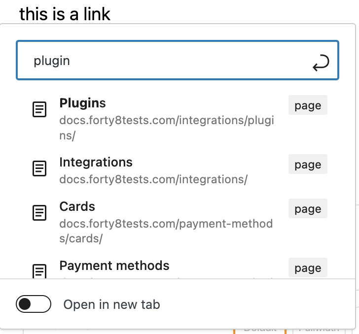
When you start typing, suggestions of pages will start appearing. Select your destination from the suggestions list or type it manually.
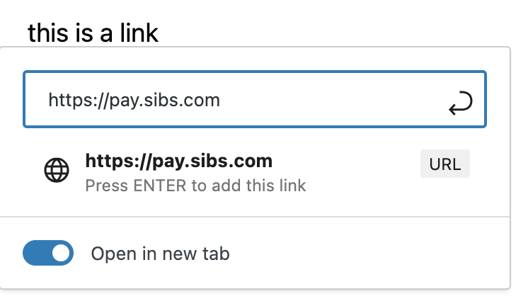
Enable Open in a new tab when needed (linking to external sources).
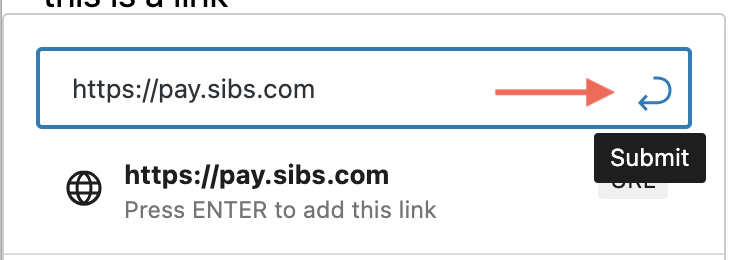
After you added the link URL, click on the enter icon.
Adding links to email addresses
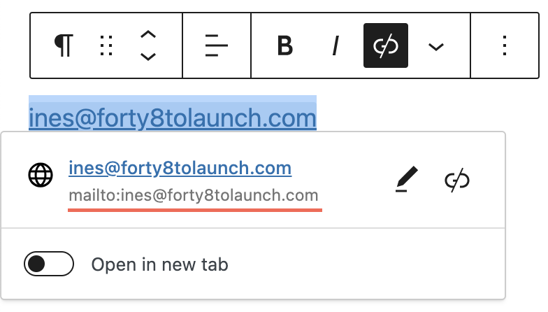
To add a link to an email address, just select the address and click on the Link item on the block toolbar, Wordpress automatically identifies the email address and will add the correct link structure.
If you need to add an email link manually, you should add it in the link URL field following this format (no spaces):
mailto:emailaddress@gmail.com
This will automatically trigger the user’s email client to open and start a new email, there is no need to enable the Open in New Tab option.
Highlighted code text
A Highlighted code text displays text in a specific code style font (roboto Mono) and applies the custom background and text colors that you choose. This helps to emphasize code terms or make them visually distinct on the front end of your website.

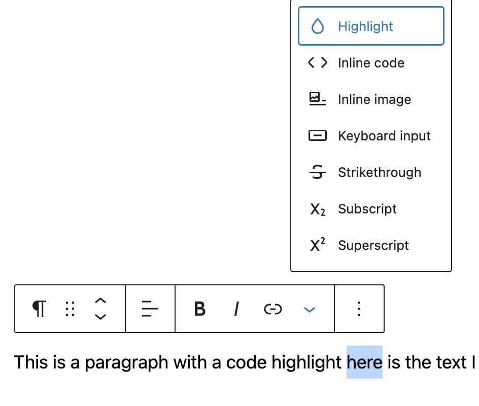
1. On a text area, select the text you want to highlight, click on the down arrow item on the block toolbar and click Highlight
2. Select the text color and the background color you want to use. If your background is light, do not change the text color.
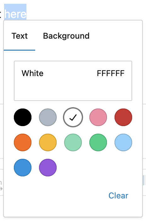
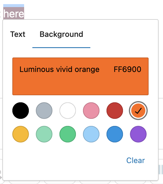
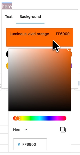
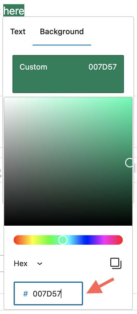
3. Click on the selected color area to see more options if you want to manually add your color code.
Highlighted code text within a custom block
A Highlighted code text displays text in a specific code style font (roboto Mono) and applies the custom background and text colors that you choose. This helps to emphasize code terms or make them visually distinct on the front end of your website.

1. On any custom block that does not include the highlight menu option, follow the steps below to create a highlighted text.
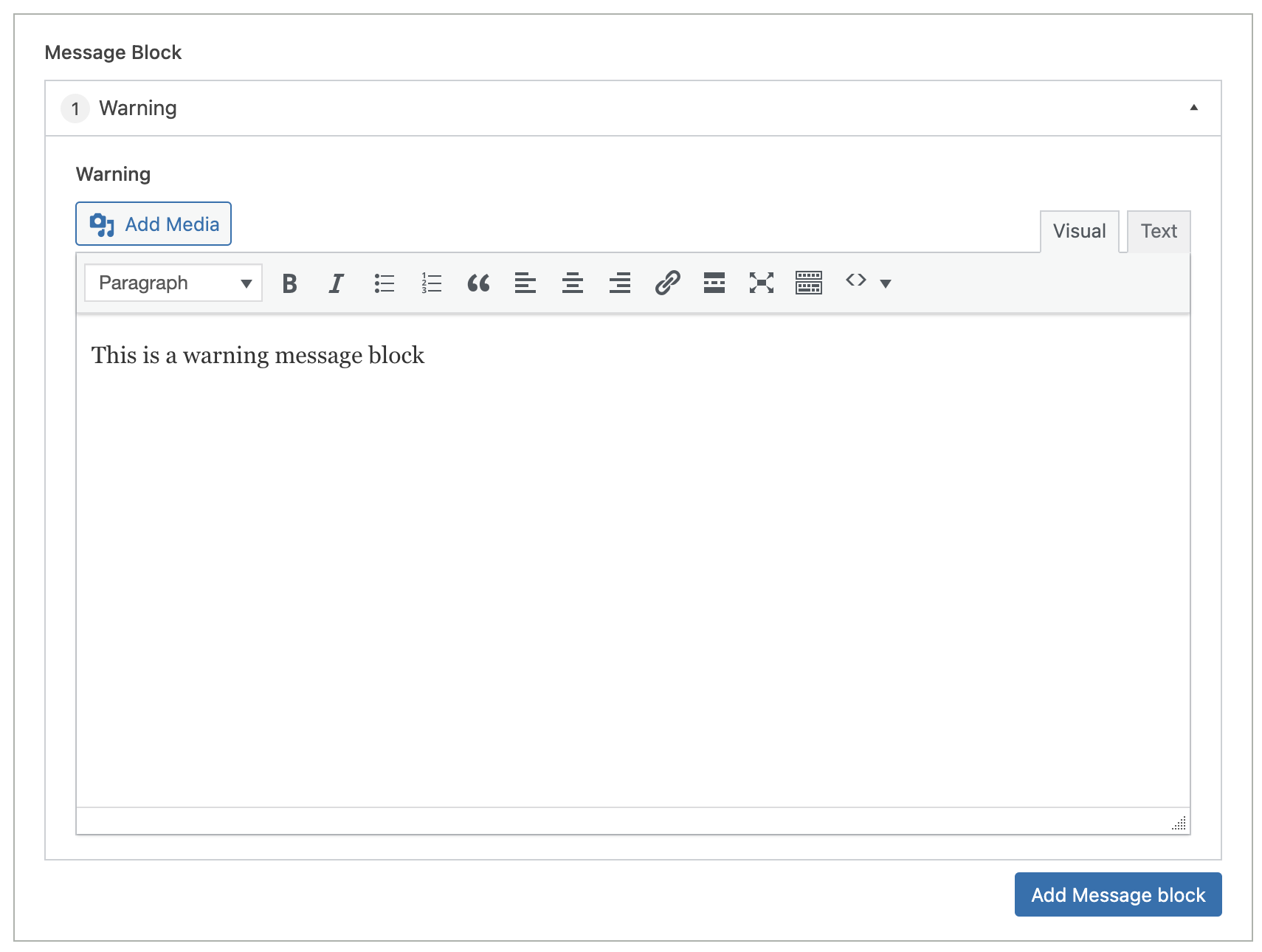
2. On a text area, select the TEXT tab to enable code editor mode.
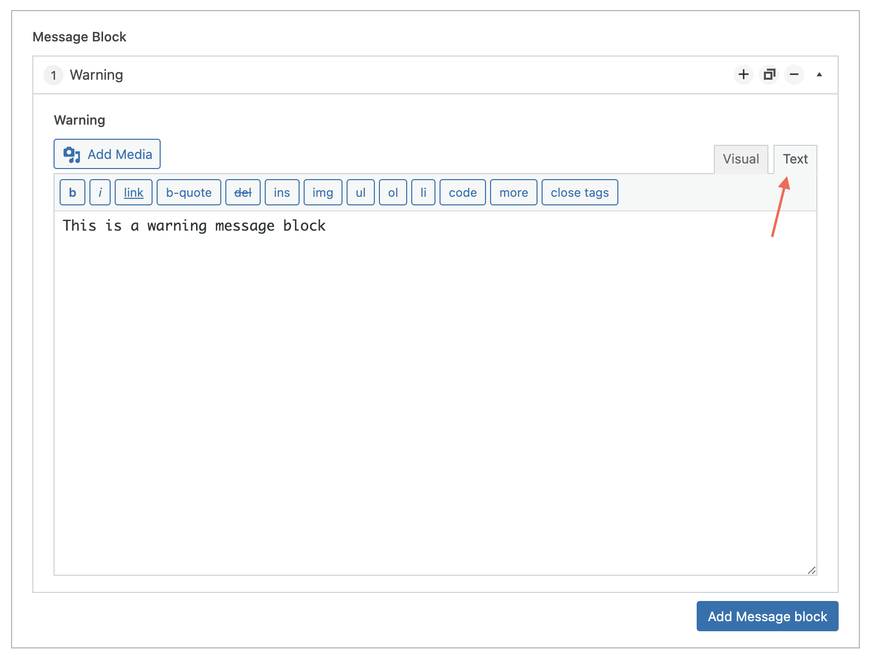
3. Add a <mark> tag around the word(s) you want to highlight, do not forget to close the tag with </mark>.
The structure to follow is: <mark>highlighted text</mark>
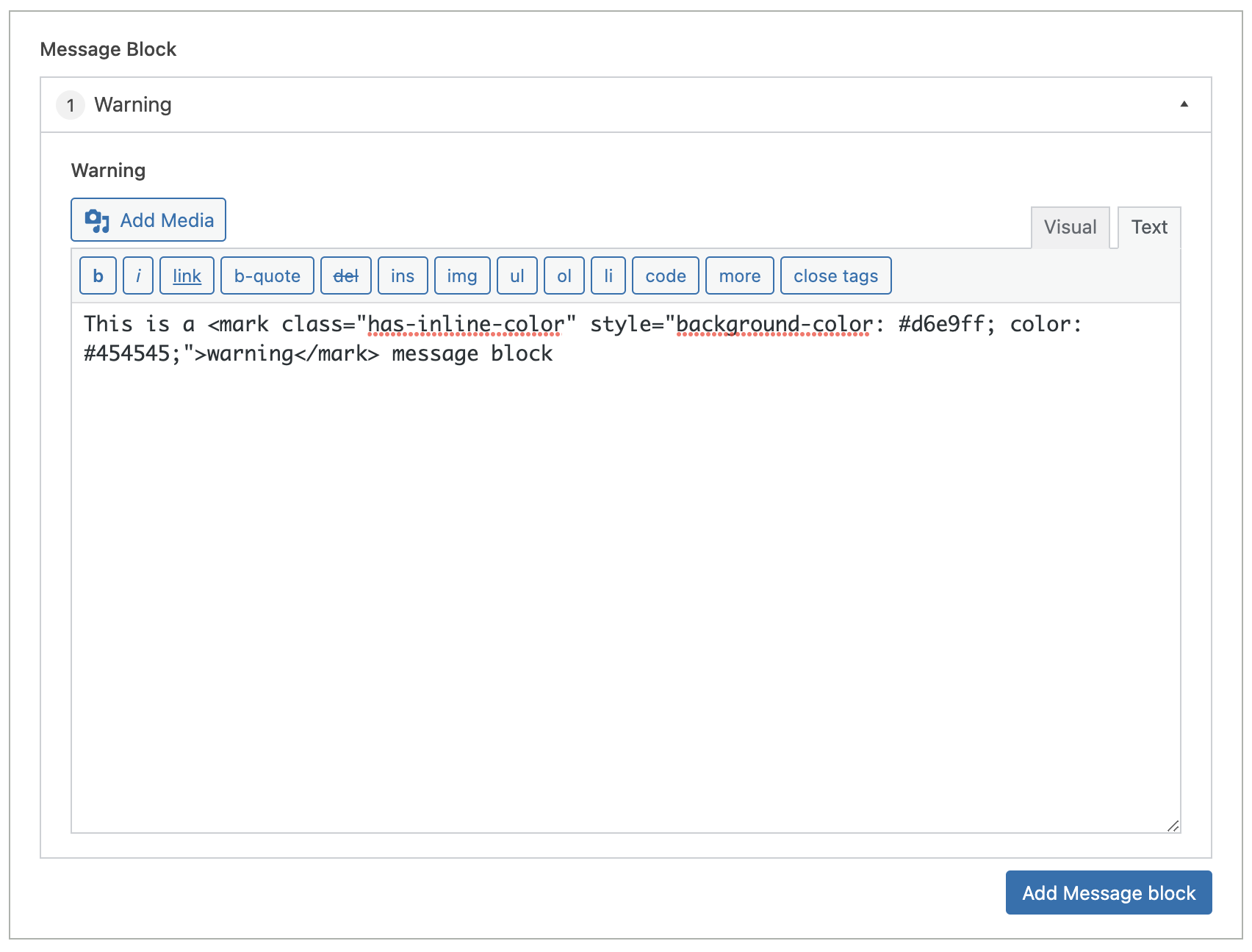
This tag must have the class has-inline-color and the styles that will define the highlight background color and the text color.
By default the text color is #454545 there is no need to add the color attribute when your highlight background is light.
To change ONLY the background color, your highlighted text code will look like this:
This is a <mark class=”has-inline-color” style=background-color:#E9E9F5;”>transactionSignature</mark>warning</mark> message block
To change both the Background and the text color, your highlighted code will look like this:
This is a <mark class=”has-inline-color” style=”background-color: #E9E9F5; color: #454545;”>warning</mark> message block

Blocks
WordPress Gutenberg blocks are modular components that enable users to create and customize content layouts in the WordPress editor. Each block serves a specific purpose and can contain text, images, multimedia, and it is styled according to the website UI and UX guidelines provided.
Blocks offer a flexible and intuitive way to structure web pages without relying on page builders or custom code.
Basic tables
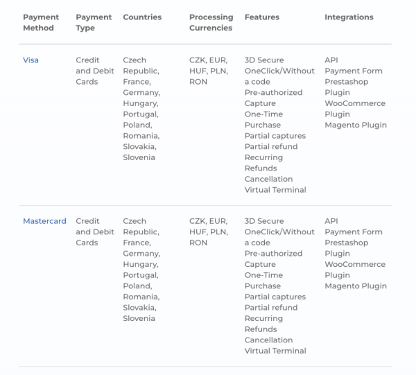
An HTML basic table is a structured grid-like element used to organize and display tabular data on a web page, consisting of rows and columns.
Follow the steps below to create and edit tables.
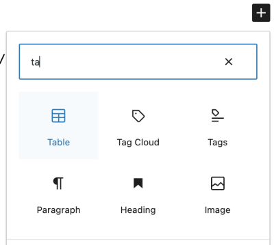
1. Add a new block and select Table
2. Define the number of rows and columns you will need and click Create Table. Rows and columns can also be added later.

3. On the block settings panel (right sidebar) enable the option Header section. This section will appear on the top row of your table and this is where you’ll add your table headers.
The table will automatically assume all styling rules, there is no need to make the headers bold and the cell separator lines will assume the correct color and weight.

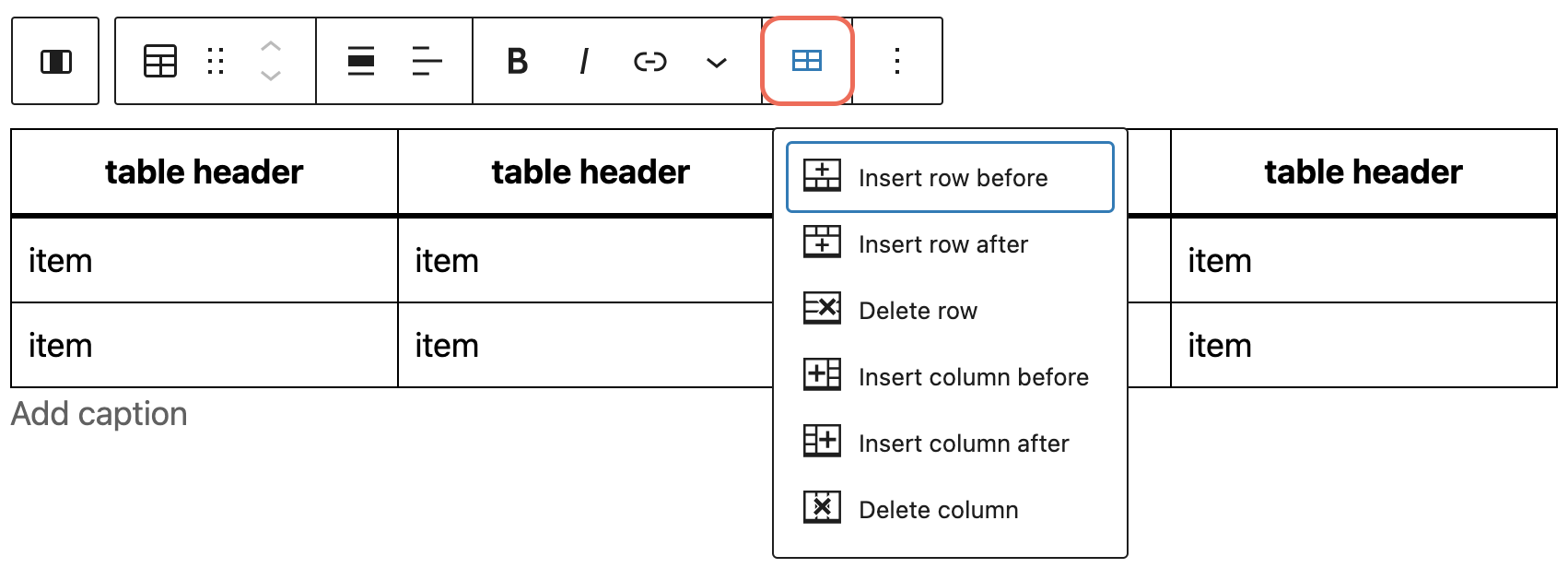
4. When you are editing your table, you can insert or delete rows or columns by clicking the Edit Table icon.
Accordions
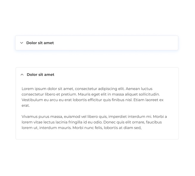
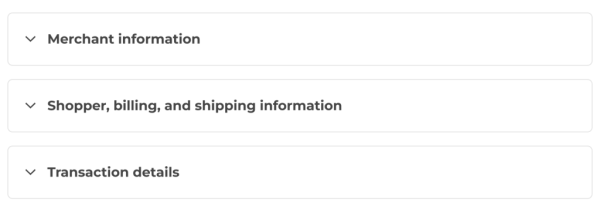
Accordion blocks are used to display collapsed content that can be expanded to show the accordion content. The content area can contain text (paragraph) or any other block type.
The accordion will automatically assume the website styles once it is published.
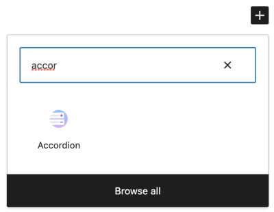
1. Add a new block and select Accordion.
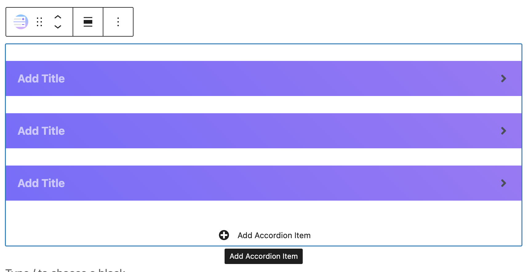
2. Three purple accordion boxes will appear in your editor.
To add more accordions click + Add Accordion Item just below the last purple accordion box.
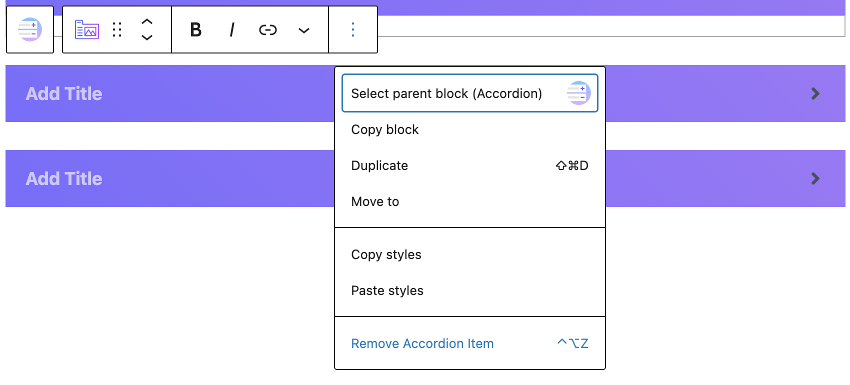
3. To remove the accordion boxes you don’t need, click to select the accordion you wish to delete, click on the three dots block toolbar item and then click Remove Accordion Item. Do this for each accordion you wish to delete.
4. To add a title to your accordion, type or paste it in the purple box, where it says Add Title. Click in this are and you can start typing or pasting your title.

5. To insert text into your accordion content, type or paste the text. It is possible to style the text just like in any other body text area.

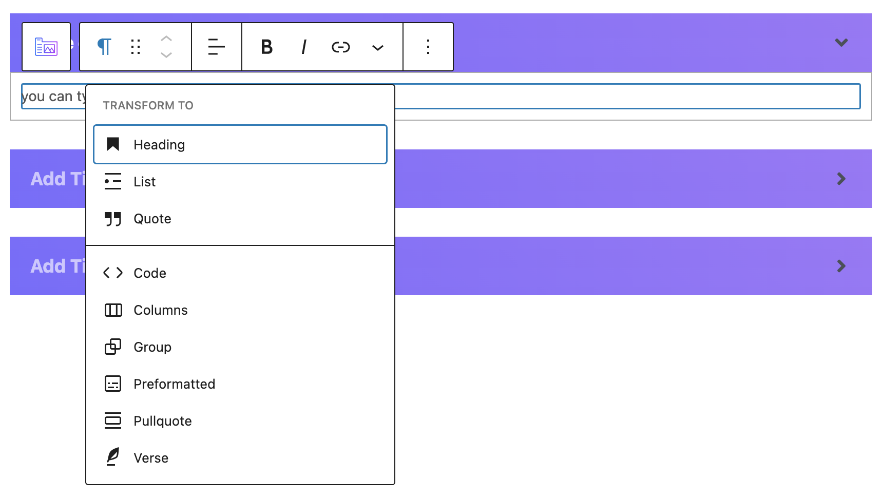
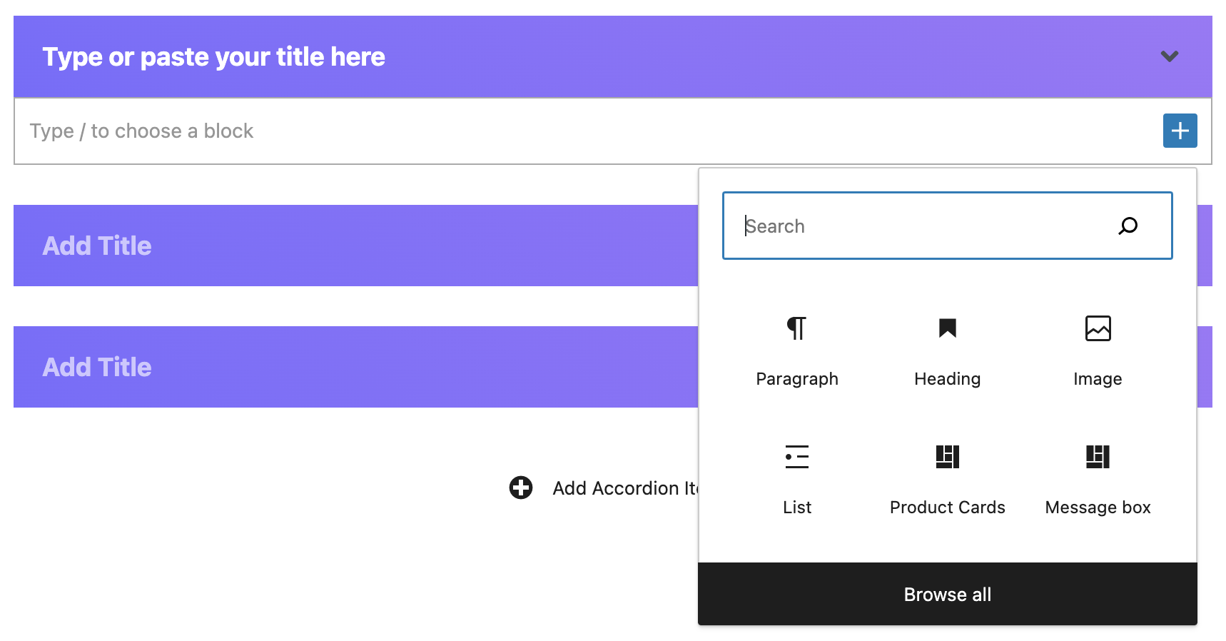
6. It is also possible to insert any block inside the accordion content area, by clicking the plus icon on the bottom right corner of the accordion content area.
Link cards
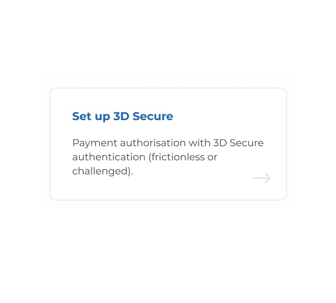
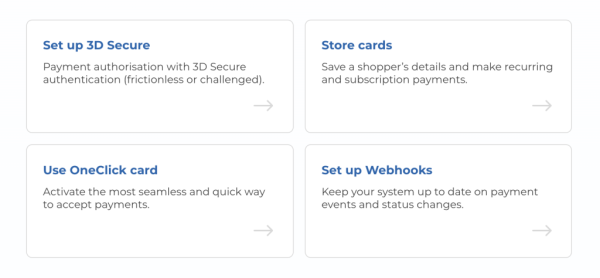
Link cards are simple cards that include a title, a brief description (limited to 85 characters), and a link to specific pages or content within the website. Link cards are displayed in two-column rows and provide a concise and visually appealing way to present information and direct users to relevant sections or resources on the website.
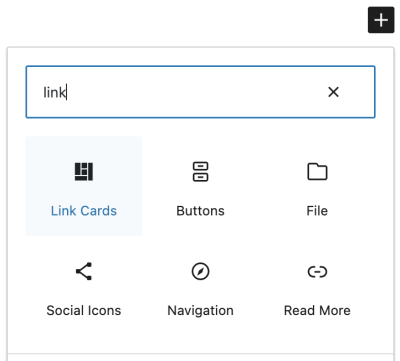
1. Add a new block and select Link Cards.
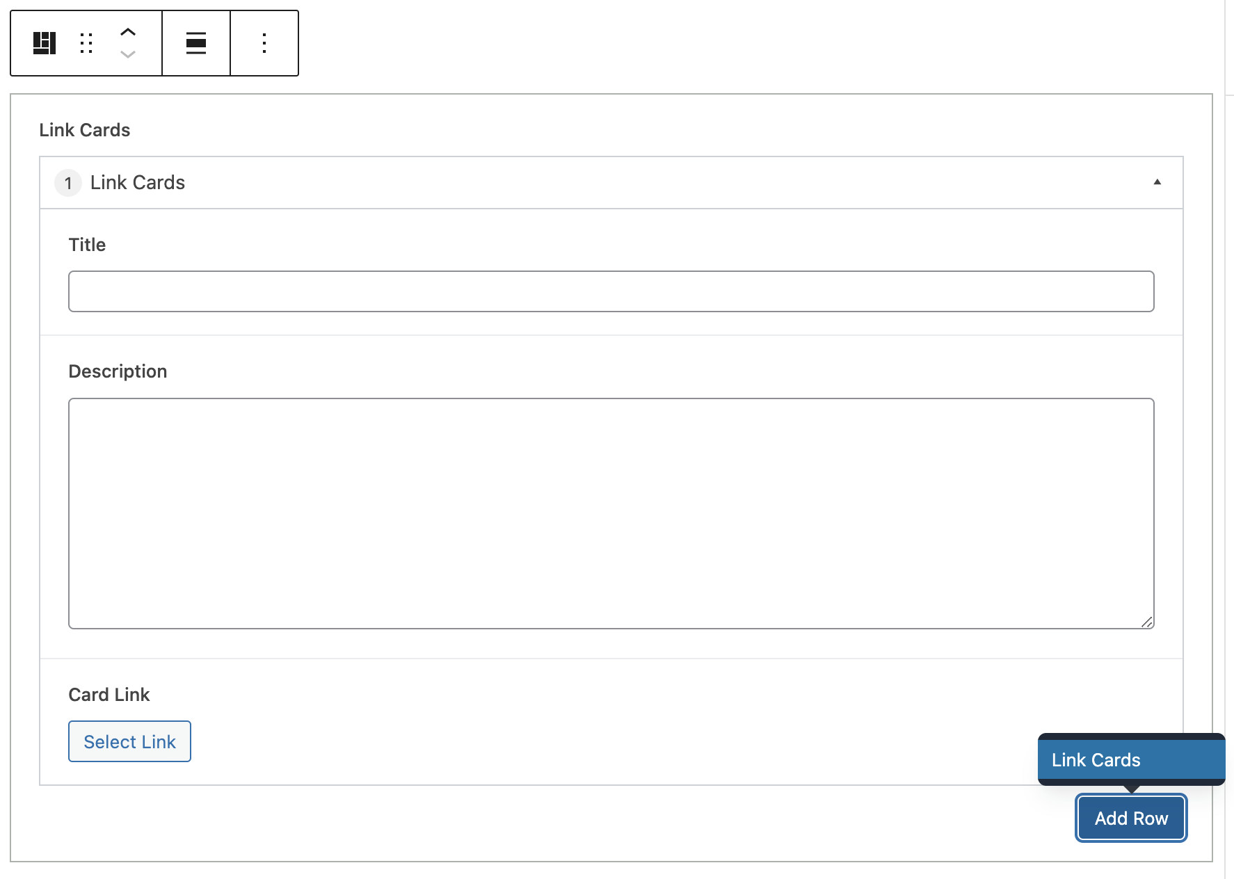
2. To start adding cards click Add Row and then click Link Cards

3. Fill-out all the fields (Title, Description and Link – the arrow, as well as all the styles, will be displayed automatically on the frontend) for each card. To add more cards click Add Row > Link Cards.
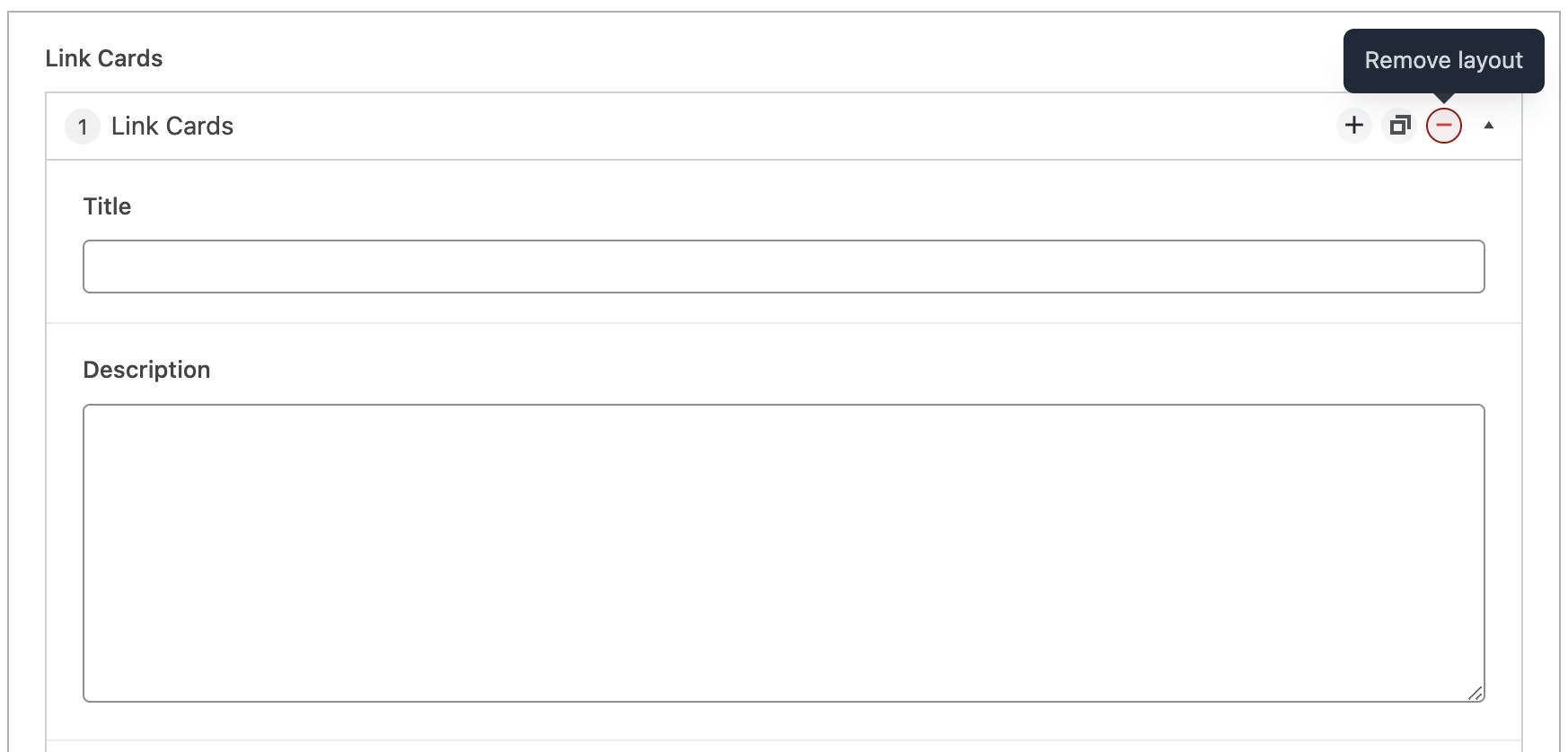
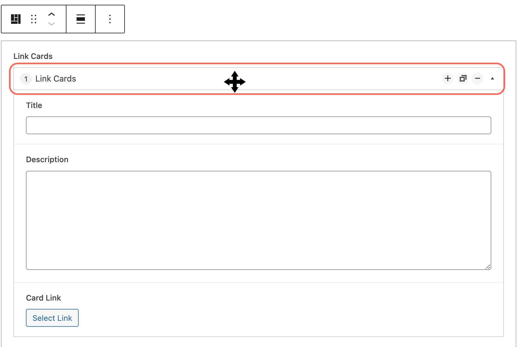
4. You can duplicate or remove cards by using the tools that appear in each card’s content area when you place your mouse cursor over it. When you place your cursor on the Link Cards header, you are also able to move it and change the order the cards are displayed by dragging and dropping it within your Link Cards list.

Category cards
Category cards are showcased in rows of three columns, presenting visual cards with images. These cards serve as clickable links that direct users to specific categories or main sections of the website.

1. Add a new block and select Category Cards.
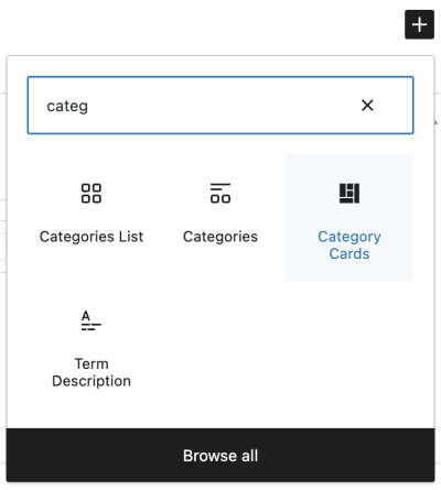
2. To start adding cards click Add Card and then click Category Cards.

3. Fill-out all the fields for each card. To add more cards click Add Card > Category Cards.
When adding images to the cards, make sure all images have the same proportions, to keep all the cards correctly aligned in the frontend.
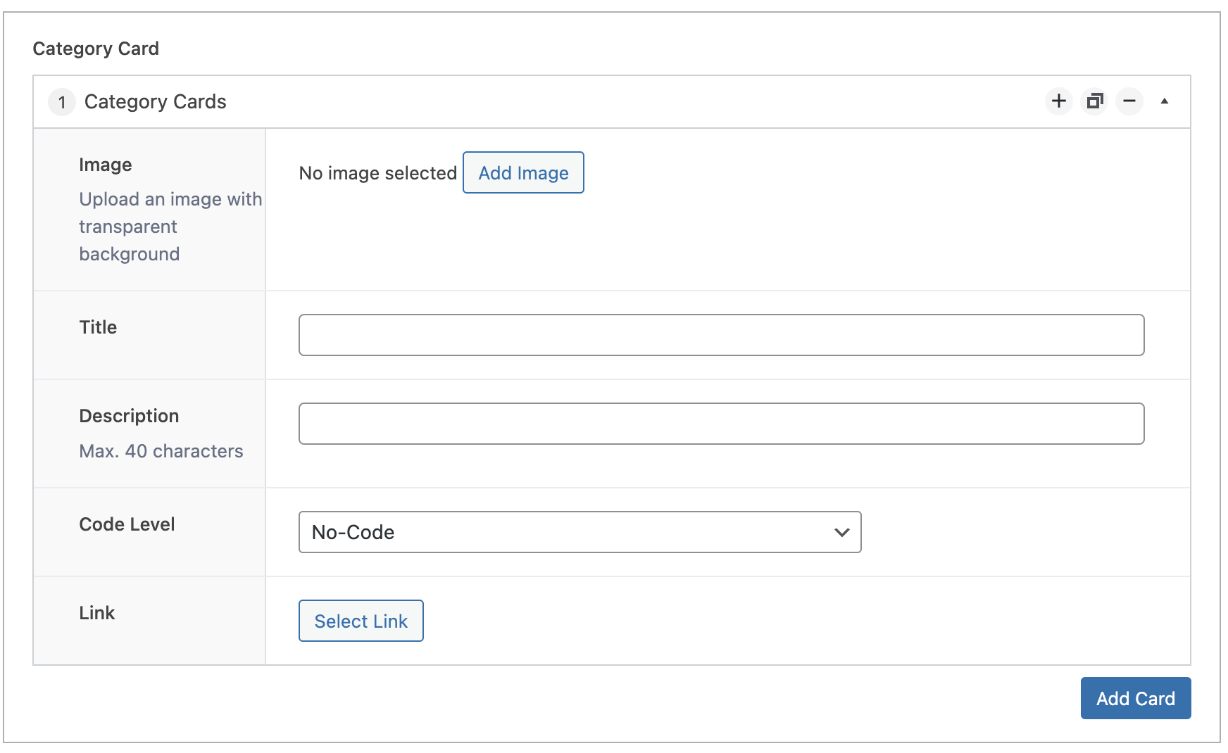
4. You can duplicate, remove or change your cards order by following the same steps as shown in Link Cards.


Product cards
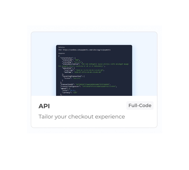
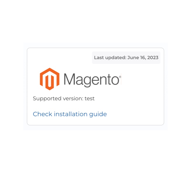
Product cards are organized in rows of two columns, providing high-level information about a particular product. These cards serve as a gateway to access the documentation specific to each product, allowing users to learn more about its features, installation guides, and other relevant resources to enhance their understanding and usage.

1. Add a new block and select Product Cards.
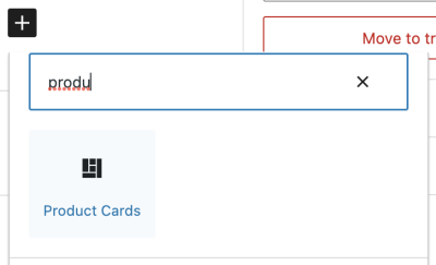
2. To start adding cards click Add Row and then click Product Cards.

3. Fill-out all the fields for each card. To add more cards click Add Row > Product Cards.
When adding images to the cards, make sure all images have the same proportions, to keep all the cards correctly aligned in the frontend.

4. You can duplicate, remove or change your cards order by following the same steps as shown in Link Cards and Category Cards.


Bullet List – blue
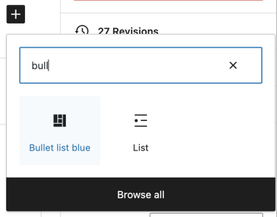
Bullet List Blue is visually different from regular bullet lists and it displays the content list in a vertical timeline or step-by-step format. It automatically generates bullets for each point added. Simply input the text for the bullet points as paragraphs or headings, and the list will display them in a timeline-like format.
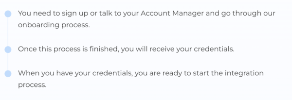
1. Add a new block and select Bullet list blue.
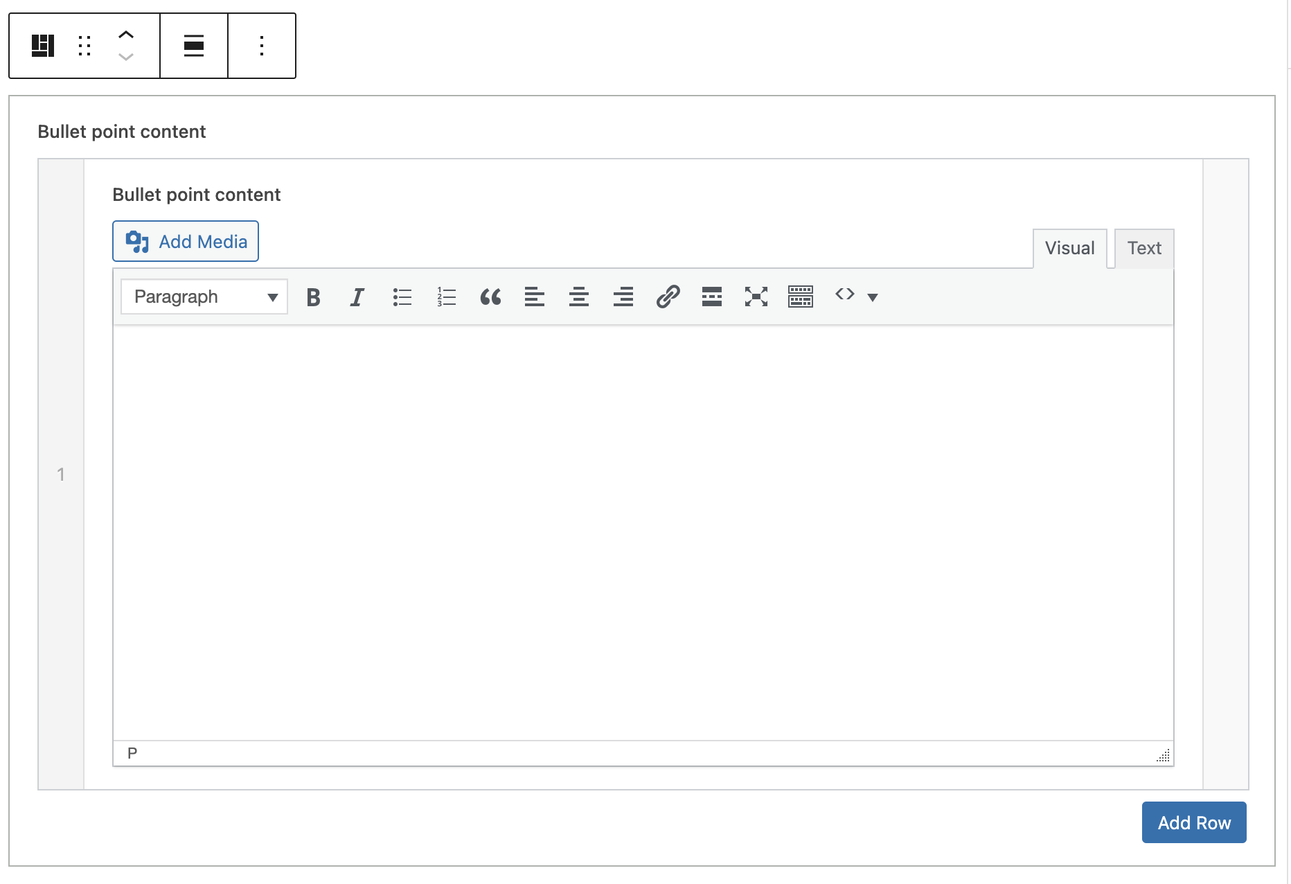
2. To start adding bullet points click Add Row

3. Insert the bullet point content in the text area field. This text can be formatted like any other text area fields – bold, italic, highlighted text, headings etc.. – Media can also be added to bullet points.
Click Add Row to add another bullet point.
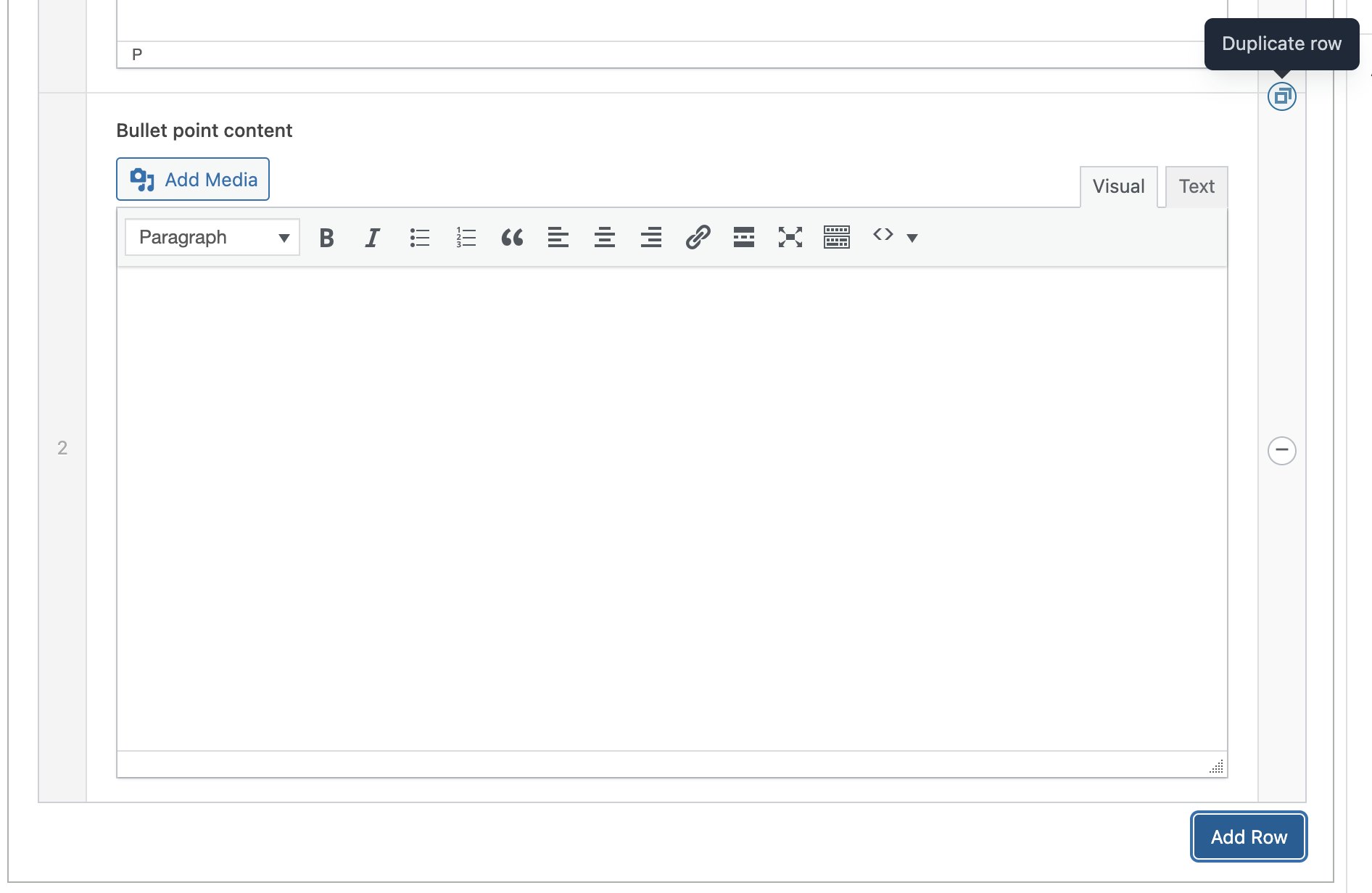
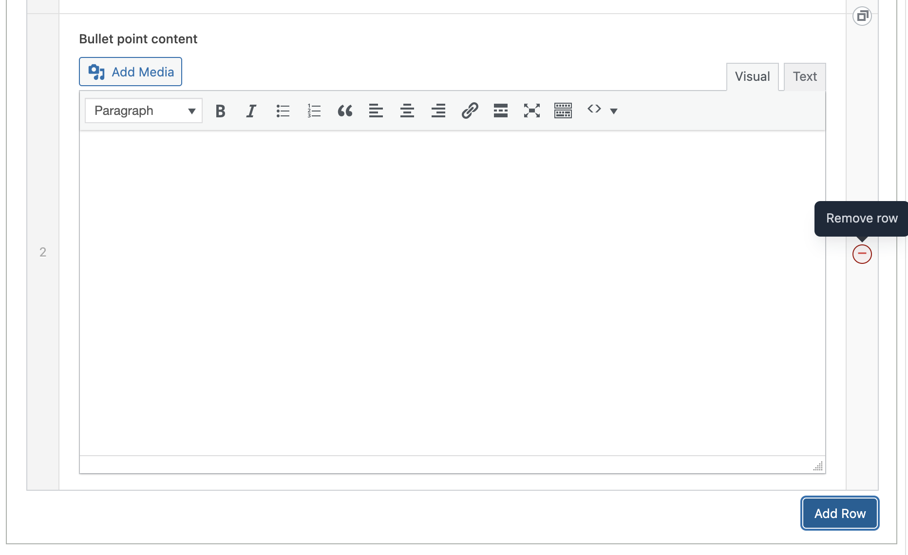
4. You can duplicate, remove or change your cards order by following the same steps as shown in Link Cards and Category Cards.

Video – Loop and autoplay
Bullet List Blue is visually different from regular bullet lists and it displays the content list in a vertical timeline or step-by-step format. It automatically generates bullets for each point added. Simply input the text for the bullet points as paragraphs or headings, and the list will display them in a timeline-like format.
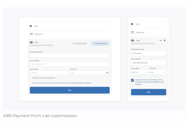
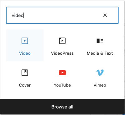
1. Add a new block and select Video.
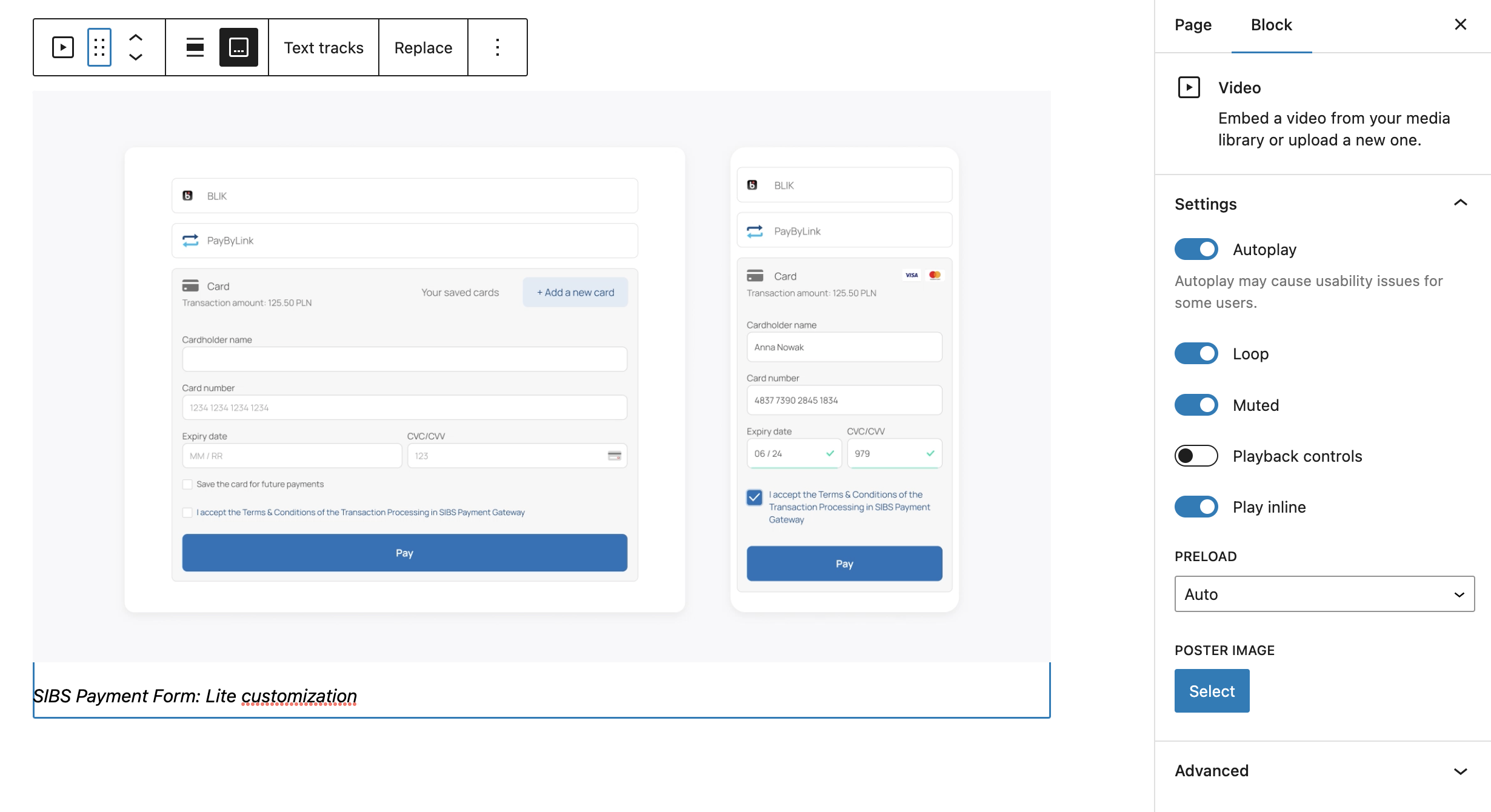
2. To add your video, you can upload a nee file such as mp4, use a video already uploaded to your media library or embed a video from a URL (from youtube, vimeo, etc..).

3. To make the video autoplay on a loop, the following settings must be enabled:
- Autoplay
- Loop
- Muted
- Play inline
4. IMPORTANT!! Lastly, click on the block’s “Advanced” section to reveal the advanced options and on the field ADDITIONAL CSS CLASS(ES), add autoplay-loop-video

Code Snippet
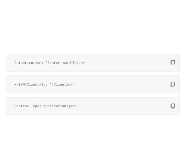
Code blocks are used to display code snippets in a dark blue background. These blocks preserve the indentation of the code and include a “copy code” link on the top right corner, making it convenient for users to copy the entire code snippet to their clipboard with a click.
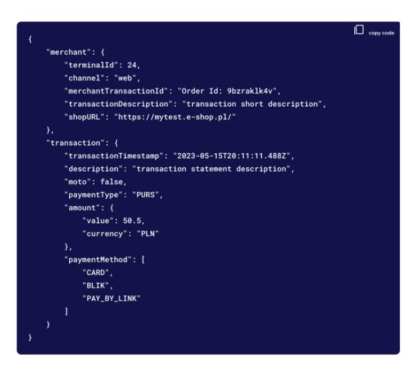
1. Add a new block and select Code.
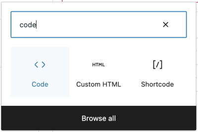
2. Type or paste your code snippet

Code Snippet – single line
Code blocks are used to display code snippets in a dark blue background. These blocks preserve the indentation of the code and include a “copy code” link on the top right corner, making it convenient for users to copy the entire code snippet to their clipboard with a click.
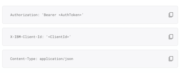
1. Add a new block and select Code.

2. Type or paste your code snippet

3. IMPORTANT!! Lastly, click on the block’s “Advanced” section to reveal the advanced options and on the field ADDITIONAL CSS CLASS(ES), add singleline

Tabbed Content
Code blocks are used to display code snippets in a dark blue background. These blocks preserve the indentation of the code and include a “copy code” link on the top right corner, making it convenient for users to copy the entire code snippet to their clipboard with a click.

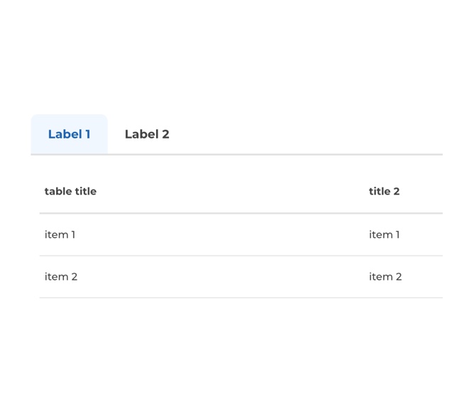
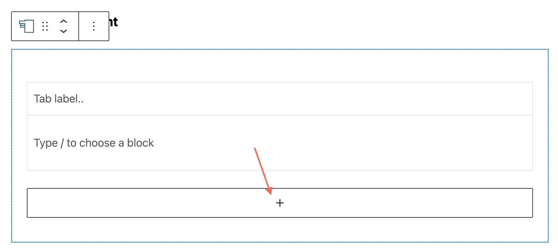
1. Add a new block and select Tabs Block.
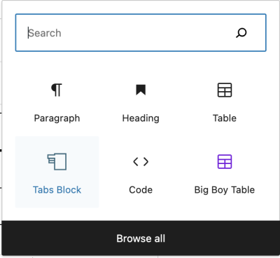
2. On the Tab Label area, type your tab title, on Type/to choose a block, type or paste the tab content, or select any block to add to the tab
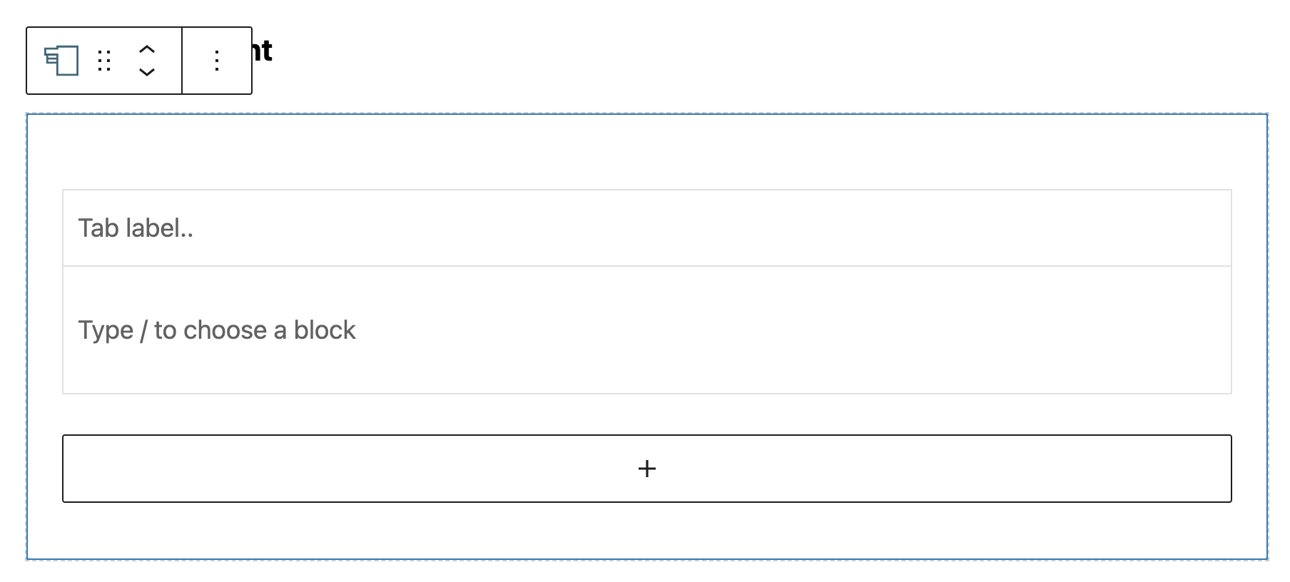

3. To add another tab, click the plus icon and follow the same steps
Big Blue Button
Code blocks are used to display code snippets in a dark blue background. These blocks preserve the indentation of the code and include a “copy code” link on the top right corner, making it convenient for users to copy the entire code snippet to their clipboard with a click.

1. Add a new block and select Buttons Block.
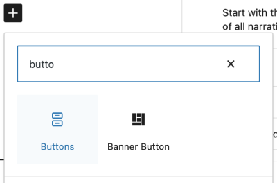
2. Type the text the button should display directly on the dark grey button area

3. Add the link

4. On the Advanced tab add the “Additional CSS Class” BigBlueButton


